I consider this to be a good shot. It was my only my second wedding gig and a job I got completely by surprise. I was not supposed to be the photographer for this wedding, I was a guest. But the task became mine after the original photographer failed to show. The plus about getting the job at the last minute? No time to get nervous. The minus? No time to prepare. You can read about the back story in this post.
This past Saturday I was in my last "Digital Darkroom" class making some prints of the images that I took of a wedding over the summer. On the workstation beside me was Patrick Kornak, one of my instructors from other photography classes. He's a great guy and always very generous of his time to help others. My images caught Patrick's eye and he leaned over and offered a quick critique. Patrick has been shooting pictures since he was 12 years old so if he is willing to offer a little critque, I'll take it.
A little about critque...
An honest critique of your images is absolutely invaluable. Some people fear having their work evaluated by their peers or superiors. I relish it! Sure we can all take it too personally and it can be a little deflating sometimes but if you are fortunate enough to have a skilled and unbiased individual evaluate your images it truly is a fantastic opportunity to learn and grow. My only two pieces of advice when looking for someone to critique your work is a) find someone who knows the craft and b) look beyond friends and family. Unless your mom is Annie Leibovitz, she will probably not give you the unbiased feedback you need.
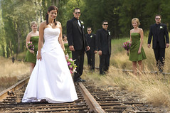
So what is wrong with this picture?
Really there is nothing "wrong" with it but there are a few things that could be improved.
Technical? The technical is good. Exposure, colour balance, sharp subject - all the basics are there.
Composition? Well, here is where Patrick made some good suggestions. I added some letters to the image below so the trouble spots could be quickly identified.

Let us start with "A". This girl is too close to the subject. She ends up being a bit distracting and we do not see all of her like we do the others. We should probably switch her up with girl "D" or at the very least put some distance between her and the bride.
"B" has pretty much the same problem as "A". She crowds the subject and gets lost behind all the others. She might be better over where "A" was but with a bit of a gap between her and the bride. Despite me constantly reminding people that "if you can't see the camera, the camera can't see you" some people still found a way to get lost. Truthfully though this bunch was great to work with and any one of them getting lost in the shuffle is my fault, not their's.
Mister "C" (the groom) needs one small tweak. Remove the shades! It is minor but I really want to see the eyes of the bride and groom. I'm not so concerned about the rest of the wedding party as they are deeper in the background but the B & G need to be looking good and consistent at all times. If both wanted to wear sunglasses, fine, it is their choice. But to have one with and one without is certainly not the best.
And finally, "D". Her position in the frame is good but Patrick thought she could use a small adjustment to get her looking even better. His suggestion was to have her bend a bit in to one knee and put the weight on her back foot. This will help to accentuate the feminine form. Guys are a bit easier. As long as they aren't making a rude gesture or picking their nose when you snap the picture, you're golden. Ha ha!
So what was good about the shot? Patrick thought the arrangement, although somewhat unconventional, really worked well and he also commended me on the nice leading lines of the train tracks bringing the eyes right to the bride and groom. But more than anything else, the bride and groom loved the shot and their opinion is the most important of all.
Keep shooting pictures and keep on learning.


No comments:
Post a Comment