Wednesday, September 23, 2009

Sunshine, Yogis and High-speed Sync...

I had the pleasure of doing a shoot with John and Eric Pattison. Brothers, yogis and all around good guys. They needed some shots for their web site and I was happy to help.

_MG_9942


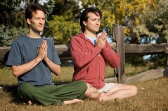
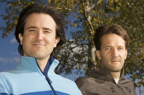
We ended up starting the shoot at 3PM with clear skies and full on sun! The day didn't start out that way of course. I preferred the conditions in the morning and for most of the day where it was bright but overcast. It's like having a giant softbox. But it's Calgary so a particular weather pattern typically never hangs around long enough to be useful.

I was not going to have the brothers staring in to the sun so it was understood from the beginning that fill flash was going to be necessary. I wanted limited depth of field, which meant shooting my 24-105mm f/4.0L wide open. It was evident from the first few test shots that normal maximum flash sync speed of 1/250th of a second was not going to cut it. The test shots were well above that.

I needed a new best friend, quick! The new best friend was high-speed sync. According to the Canon 580EX II manual, high-speed sync flash can synchronize with all shutter speeds and is no longer limited to 1/250th of a second. Cool. The short answer on the difference between normal flash and high-speed sync is with normal flash it is a single, quick burst of light. High-speed sync on the other hand the flash is continually pulsed at a lower power setting creating almost continuous lighting. Normal flash will freeze motion because it is a one-shot, quick burst of light. High-speed sync acts more like continuous lighting so it does not have the same "freeze" properties of normal flash but because you are typically using it at much, much faster shutter speeds, the subject will likely get frozen by the shutter speed. The other caveat is that high-speed sync fires the flash at lower power to maintain the pulsing action so the range is limited. But considering you can sync at any shutter speed, I for one am willing to live with the shortened range. Oh, and, if it wasn't obvious the flash needs to be in ETTL mode so that means it is tethered to or on top of the camera.

So with the flash set to ETTL and high-speed sync I could snap away and not worry about the shutter speed. Nice! I popped a 1/4 cut of CTO (colour temperature orange) on the bare flash for a bit of warmth and I was good to go. For these types of shots I generally set the exposure compensation to one stop (EV -1) below the metered value. Then I use flash exposure compensation (FEC) to bring the the light on my subject up to my liking. You end up with roughly a one stop difference between the background and the subject, which helps to pop the subject off of the background.

My explanation of high-speed sync flash is pretty simple. Ralph Paonessa has a great page on high-speed sync flash here.

_MG_9782

Namaste.

Saturday, September 19, 2009

Patience

Patience. I don't have any. OK, maybe that is a bit of an exaggeration. I have some. I just need to cultivate more.

A couple of weeks ago I did a family portrait shoot for some friends. They were pleased with the results. I was not. I wasn't a train wreck but the results were certainly beneath my capabilities as a photographer. I attribute the less than stellar results to lack of patience, a smidgeon of carelessness and maybe the fact that I was in short sleeves in a gusty 12 degree night, freezing my butt off!

_MG_9387

This picture is a great example of impatience. The exposure is good, it is sharp, good framing, blurred background, etc but there is a not-so-nice shadow cutting in to Terra's face. Boo-urns! Simply taking a bit of extra time to review on the LCD would have caught the error. It could have been easily corrected by swinging the flash a bit more forward or getting Terra's face more in line with her best pal Kona.

Too late for that shoot but we are going to do it again as soon as they have a bit free time.

Tomorrow I have a very important photo shoot so to prepare I am going to do a couple of things. One, I am going look at the work of photographers I admire to get a bit of energy and inspiration. And two, I am going to repeat the chorus from the Guns 'N Roses song "Patience" over and over in my head during the photo shoot.

Little patience, mmm yeah, mm yeah
Need a little patience, yeah
Just a little patience, yeah
Some more patience, yeah
Could use some patience, yeah
Gotta have some patience, yeah
All it takes is patience
Just a little patience
Is all you need

Nice.


Tuesday, September 15, 2009

Go in to the Light...

Today's lunch quest was to find good light and make a picture. You would think that noon, downtown on a clear, bright sunny day would be the worst time to find good light but.... you would be wrong. It's out there, you just have to look.

I took a one day workshop back in July with Parish Kohanim. He spoke emphatically about finding good light - first. At one point Parish took us out of the classroom and in to the common area to seek out the good stuff. Within two minutes he found this amazing patch of light coming through the translucent class ceiling. He called our models over and WOW... I was stunned. What a difference!

Back to today. Downtown, high-noon, bright sunny day amongst all the buildings and skyscrapers. You wouldn't think it but there are many opportunities to find quality light. Shade is the easy answer but I have discovered really impressive light that has been bounced off of few skyscrapers. Maybe it is just a single bounce off of one building or, even better, reflecting off one building to another before dropping on to street level. Now that can be really nice.

After spending most of my lunch surfing the back alleys, I noticed this great patch of light falling on an old bank building. The attractive pillars and background sealed the deal.

Here's the keeper.

_MG_9688


Awesome!

Tuesday, September 8, 2009

Fun with White Balance...

I was surfing back alleys the other night and came across an interesting scene.

People's Lunch
Shooting just before sunset I had my camera's white balance set to cloudy. My Canon 40D manual lists the Kelvin colour temperature value of cloudy to be 6000K. (Wikipedia has an entry on colour temperature here) I shot the first picture (on the right) wide open at f/4.0, 1/25th at ISO 800 as ambient light was getting scarce. My exposure was set to maintain good detail inside the room and so "People's Lunch" and the surrounding brick was visible.

When I reviewed the shot on my LCD the exposure was good but the kitchen light was too yellow. Easy fix. I was shooting with my white balance set to cloudy (6000K) and the kitchen light was likely tungsten (3200K) or white fluorescent (4000K) hence it appeared quite a bit warmer - yellow and orange. A quick flick of the fingers set the white balance to tungsten.

Below is the second shot with white balance set to tungsten.

People's LunchNeat. I was expecting the kitchen light to appear more natural, which it did, but I was surprised with the amazing blue. Don't get me wrong, I knew setting white balance to tungsten would turn all the daylight in the frame blue but I was surprised at the creative effect it produced. This is a simple example of how white balance can be used creatively. My preference is the natural looking brick with the warm, inviting light of the kitchen but the blue shot makes me envision some kind of mysterious moonlit scene. Of course white balance can always be changed later using software but I believe it is more important to get it right in the first place.

The white balance setting is used to make sure whites appear white under various types of lighting. Our eyes do that automatically but the camera needs a bit of help. In most cases it is best to set the white balance for the dominant light source and then small adjustments can be made using software if necessary.

If a mish-mash of lighting types is just too crazy then you can always shoot black and white.

Vern's


Kidding... well, not really. I fancied the shot above but it was some sick combination of daylight (5200K) and fluorescent (4000K) lighting. The two types are close in colour temperature but most fluorescent lights give off a sick greenish colour cast that even after some post production tinkering I could not the image looking completely right. Black and white just ended up looking better.

Sometimes you need a little help...

A great tool for setting a custom white balance is a grey/white card - 18% grey on one side, white on the other. Lastolite makes a product called EzyBalance which is just that. It has 18% grey on one side, white on the other and it folds down in to a small pouch so it is easy to take with you. I have one and it works great and is simple to use. Here is how you do it. Set the camera to manual and meter proper exposure on the grey side being sure that the light hitting your subject is hitting the grey card. Take a shot. Using the same exposure flip the card over and take a shot of the white side. The picture of the white side can be used to set a custom white balance in the camera (check your manual as this varies by manufacturer) and the shot of the grey card, which was also used to meter the light, can be used in post production to correct the white balance using software.

Easy peasy.

There is another good article on setting a proper white balance here.

Tuesday, September 1, 2009

Lines, Textures and Colours, Oh My!

The other night on the way home I finally took a picture of these stairs that I pass many times during the course of a week. They always catch my eye but on this particular night I actually had my camera with me, and oh, the sun was setting too. Here is the keeper shot.

_MG_1206


Let us break down some of the visual elements to see why this photograph works.

Lines

This shot has plenty of strong lines - vertical, horizontal and of course, diagonal. I really liked how the diagonal edge of the left side of the stairs also serves as the boundary between different colours and textures. The diagonal line also draws the eye through the frame to the slice of window at the top. The horizontal lines of the brick and the steps converge on that diagonal. Digital Photography School has a short and sweet article on using diagonal lines here.

Textures

There are plenty of textures in this picture too. The texture of the rusty steps dominate but the brick, to me, is a pleasing texture that compliments the stairs nicely. Although there is little shadow in this particular shot, shadow can be an excellent visual element to amplify the "feel" and depth of texture. Texture brings life to the details. Texture all on its own can even be the subject of a photograph! However, in this case it merely enhances the character of the subject.

Colours

The stairs are completely covered in adjacent colours. Adjacent on the colour wheel, that is. These colours are also are generally understood to be "warm" - yellows, reds, oranges, etc. These warm, analogous colours give the stair case its appealing look. The coloured brick, on the other hand, runs somewhat complementary to the stairs on the colour wheel and it brings contrast to the image.

Putting it together

Now, did I think of all those visual design elements (and more) while I was composing the image? Uh, sort of... the colours and textures drew me to make the picture in the first place and while composing it I was careful to put the diagonal lines where I wanted them. I also framed it to eliminate distracting elements on the sides that I felt would detract from the final image. Shooting the picture near sunset with my polarizing filter increased the contrast and colour saturation. So yeah, I did think of a bunch.

Thinking about the visual elements when composing a photograph is a good thing but I don't believe "thinking" should dominant the process. Most times I am guilty of thinking too much, over thinking an image, instead of allowing emotions and intuition to guide the operation.

My goal is to be quite familiar with these visual design elements but to use them in an intuitive and natural manner, not forced. Just like riding a bike. With time and practice it will be so natural you won't even have to think to do it. :-)

You can read more about compositional elements here.