Let us break down some of the visual elements to see why this photograph works.
Lines
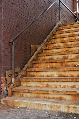
This shot has plenty of strong lines - vertical, horizontal and of course, diagonal. I really liked how the diagonal edge of the left side of the stairs also serves as the boundary between different colours and textures. The diagonal line also draws the eye through the frame to the slice of window at the top. The horizontal lines of the brick and the steps converge on that diagonal. Digital Photography School has a short and sweet article on using diagonal lines here.
Textures
There are plenty of textures in this picture too. The texture of the rusty steps dominate but the brick, to me, is a pleasing texture that compliments the stairs nicely. Although there is little shadow in this particular shot, shadow can be an excellent visual element to amplify the "feel" and depth of texture. Texture brings life to the details. Texture all on its own can even be the subject of a photograph! However, in this case it merely enhances the character of the subject.
Colours
The stairs are completely covered in adjacent colours. Adjacent on the colour wheel, that is. These colours are also are generally understood to be "warm" - yellows, reds, oranges, etc. These warm, analogous colours give the stair case its appealing look. The coloured brick, on the other hand, runs somewhat complementary to the stairs on the colour wheel and it brings contrast to the image.
Putting it together
Now, did I think of all those visual design elements (and more) while I was composing the image? Uh, sort of... the colours and textures drew me to make the picture in the first place and while composing it I was careful to put the diagonal lines where I wanted them. I also framed it to eliminate distracting elements on the sides that I felt would detract from the final image. Shooting the picture near sunset with my polarizing filter increased the contrast and colour saturation. So yeah, I did think of a bunch.
Thinking about the visual elements when composing a photograph is a good thing but I don't believe "thinking" should dominant the process. Most times I am guilty of thinking too much, over thinking an image, instead of allowing emotions and intuition to guide the operation.
My goal is to be quite familiar with these visual design elements but to use them in an intuitive and natural manner, not forced. Just like riding a bike. With time and practice it will be so natural you won't even have to think to do it. :-)
You can read more about compositional elements here.


No comments:
Post a Comment